Animations
Animations are first-class citizens in Reanimated 2. The library comes bundled with a number of animation helper methods that make it very easy to go from immediate property updates into animated ones.
In the previous article about Shared Values we learned about the useAnimatedStyle hook, that allows for creating an association between Reanimated code and view properties.
We also learned how to perform animated transitions of Shared Values.
This, however, is not the only way how animations can be started.
On top of that Reanimated provides a number of animation modifiers and ways for animations to be customized.
In this article we explore the methods that can be used to perform animated view updates.
Shared Value Animated Transitions
One of the easiest ways of starting an animation in Reanimated 2, is by making an animated transition of a Shared Value. Animated Shared Value updates require just a tiny change compared to immediate updates. Let us recall the example from the previous article, where we'd update a Shared Value with some random number on every button tap:
import Animated, {
  useSharedValue,
  useAnimatedStyle,
} from 'react-native-reanimated';

function Box() {
  const offset = useSharedValue(0);

  const animatedStyles = useAnimatedStyle(() => {
    return {
      transform: [{ translateX: offset.value * 255 }],
    };
  });

  return (
    <>
      <Animated.View style={[styles.box, animatedStyles]} />
      <Button onPress={() => (offset.value = Math.random())} title="Move" />
    </>
  );
}
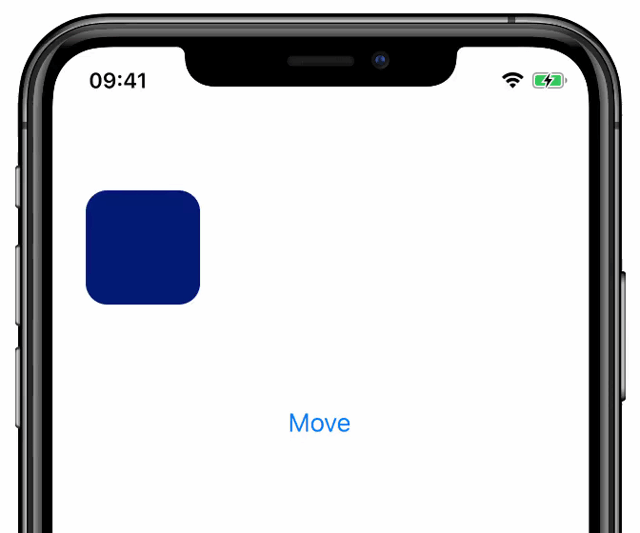
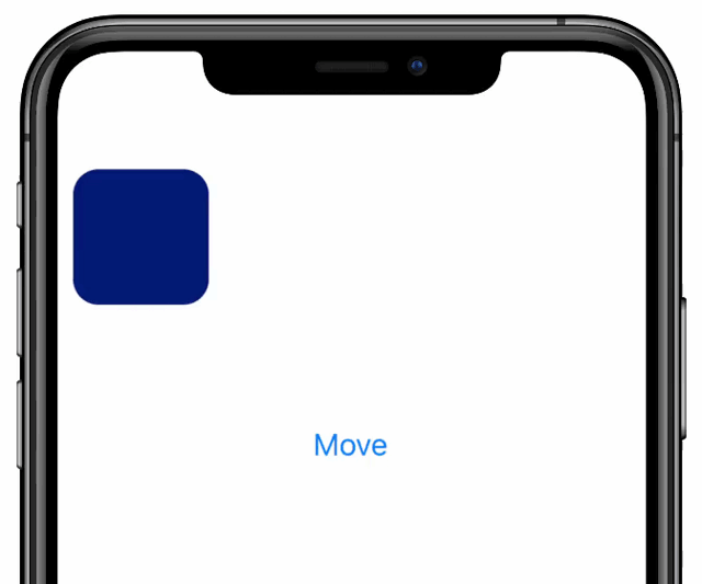
In the above example we make immediate updates to the offset Shared Value upon a button click.
The offset value is then mapped to a view translation using useAnimatedStyle.
As a result, when we tap on the "Move" button the animated box jumps to a new, random location as presented below:
With Reanimated 2, such Shared Value updates can be transformed to animated updates by wrapping the target value using one of the animation helpers, e.g., withTiming or withSpring.
The only change that we can do now, is to wrap the random offset value with a withSpring call as shown below:
<Button
  onPress={() => {
    offset.value = withSpring(Math.random());
  }}
  title="Move"
/>
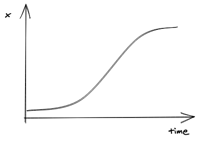
This way, instead of assigning a number to the Shared Value, we make an animation object which is then used to run updates on the Shared Value until it reaches the target.
As a result the offset Shared Value transitions smoothly between the current and the newly assigned random number, which results in a nice spring-based animation in between those states:

Animations in useAnimatedStyle hook
Animated Shared Value transitions are not the only way to initiate and run animations.
It is often the case that we'd like to animate properties that are not directly mapped onto a Shared Value.
For that, in Reanimated we allow for animations to be specified directly in the useAnimatedStyle hook.
In order to do this you can use the same animation helper methods from Reanimated API, but instead of using it when updating a Shared Value you use it to wrap the style value property:
const animatedStyles = useAnimatedStyle(() => {
  return {
    transform: [
      {
        translateX: withSpring(offset.value * 255),
      },
    ],
  };
});
As you can see, the only change compared to the example from the previous section is that we wrapped the value provided to translateX offset in a withSpring call.
This tells the Reanimated engine that all updates made to translateX offset should be animated using spring.
With this change added, we no longer need to animate the offset Shared Value updates, and can keep those updates being "immediate":
<Button onPress={() => (offset.value = Math.random())} title="Move" />
As a result we will get the exact same behavior as when animating the offset value update.
However, in this case we move the control over how value updates need to be performed from the place where we make Shared Value amends to the place where we define the View styles.
This approach is more convenient in many cases, especially when view properties are derived from Shared Value as opposed to the Shared Value being directly mapped to given styles.
Also, keeping all the aspects of view styles and transitions collocated often makes it easier to keep control over your components' code.
It forces you to have everything defined in one place vs scattered around the codebase allowing for animated transitions being triggered from anywhere.
Interrupting Animated Updates
Animated UI updates, by definition, take time to perform.
It is often undesirable to freeze user interactions with the App and wait for transitions to finish.
While allowing the user to interact with the screen while style properties are being animated, the framework needs to support a way for those animations to be interrupted or reconfigured as they go.
This is the case for the Reanimated animations API as well.
Whenever you make animated updates of Shared Values, or you specify animations in the useAnimatedStyle hook, those animations are fully interruptible.
In the former case, when you make an update to a Shared Value that is being animated, the framework won't wait for the previous animation to finish, but will immediately initiate a new transition starting from the current position of the previous animation.
Interruptions also work correctly for animations defined in useAnimatedStyle hook.
When the style is updated and the target value for a given property has changed compared to the last time when the style hook was run, the new animation will launch immediately starting from the current position of the property.
We believe that the described behavior, when it comes to interruptions, is desirable in the majority of the use cases, and hence we made it the default.
In case you'd like to wait with the next animation until the previous one is finished, or in the case you'd like to cancel currently running animation prior to starting a new one, you can still do it using animation callbacks in the former, or the cancelAnimation method in the latter case.
To illustrate how interruptions perform in practice, please take a look at the below video, where we run the example presented earlier, but make much more frequent taps on the button in order to trigger value changes before the animation settles:
Customizing Animations
Reanimated currently provides three built-in animation helpers: withTiming, withSpring, and withDecay.
There are ways of expanding that with your own custom animations (animation helpers are built on top of the worklets abstraction), but we are not yet ready to document that as we still plan some changes in that part of the API.
However, the built-in methods along with the animation modifiers (that we discuss later on), already provide great flexibility.
Below we discuss some of the most common configuration options of the animation helpers, and we refer to the documentation page of withTiming and withSpring for the complete set of parameters.
Both animation helper methods share a similar structure. They take target value as the first parameter, configuration object as the second, and finally a callback method as the last parameter. Starting from the end, the callback is a method that runs when the animation is finished, or when the animation is interrupted/cancelled. The callback is run with a single argument – a boolean indicating whether the animation has finished executing without cancellation:
<Button
  onPress={() => {
    offset.value = withSpring(Math.random(), {}, (finished) => {
      if (finished) {
        console.log('ANIMATION ENDED');
      } else {
        console.log('ANIMATION GOT CANCELLED');
      }
    });
  }}
  title="Move"
/>
Timing
As it comes to the configuration options, those are different depending on the animation we run.
For timing-based animations, we can provide a duration and an easing method.
The easing parameter allows to control how fast the animation progresses along the specified time duration.
You may wish for the animation to accelerate fast and then slow down towards the end, or to start slowly, then accelerate and slow down again at the end.
Easing can be described using bezier curve thanks to Easing.bezier method exported from the Reanimated package.
But in most of the cases it is enough to use Easing.in, Easing.out or Easing.inOut to adjust the timing curve at the start, end or at the both ends respectively.
The default duration for the timing animation is 300ms, and the default easing is an in-out quadratic curve (Easing.inOut(Easing.quad)):
Here is how to start a timing animation with a custom configuration:
import { Easing, withTiming } from 'react-native-reanimated';

offset.value = withTiming(0, {
  duration: 500,
  easing: Easing.out(Easing.exp),
});
You may want to visit easings.net and check various easing visualizations. To learn how to apply these please refer to the Easing.ts file where all the easing related helper methods are defined.
Spring
Unlike timing, spring-based animations do not take duration as a parameter.
Instead the time it takes for the spring to run is determined by the spring physics (which is configurable), initial velocity, and the distance to travel.
Below we show an example of how a custom spring animation can be defined and how it compares to the default spring settings.
Please review withSpring documentation for the complete list of configurable options.
import Animated, {
  withSpring,
  useAnimatedStyle,
  useSharedValue,
} from 'react-native-reanimated';

function Box() {
  const offset = useSharedValue(0);

  const defaultSpringStyles = useAnimatedStyle(() => {
    return {
      transform: [{ translateX: withSpring(offset.value * 255) }],
    };
  });

  const customSpringStyles = useAnimatedStyle(() => {
    return {
      transform: [
        {
          translateX: withSpring(offset.value * 255, {
            damping: 20,
            stiffness: 90,
          }),
        },
      ],
    };
  });

  return (
    <>
      <Animated.View style={[styles.box, defaultSpringStyles]} />
      <Animated.View style={[styles.box, customSpringStyles]} />
      <Button onPress={() => (offset.value = Math.random())} title="Move" />
    </>
  );
}
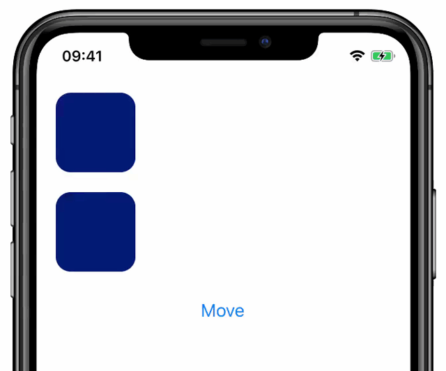
Unlike in the previous example, here we define the animation in the useAnimatedStyle hook.
This makes it possible to use a single Shared Value but map that to two View's styles.
Animation Modifiers
Besides the ability to adjust animation options, another way of customizing animations is by using animation modifiers.
Currently, Reanimated exposes three modifiers: withDelay, withSequence and withRepeat.
As the name suggests, the withDelay modifier makes the provided animation to start with a given delay, the withSequence modifier allows a number of animations to be provided and will make them run one after another.
Finally, the withRepeat modifier allows for the provided animation to be repeated several times.
Modifiers typically take one or more animation objects with optional configuration as an input, and return an object that represents the modified animation. This makes it possible to wrap existing animation helpers (or custom helpers), or make a chain of modifiers when necessary. Please refer to the documentation of each of the modifier methods to learn about the ways how they can be parameterized.
Let us now exercise the use of modifiers in practice and build an animation that causes a rectangular view to wobble upon a button click. We start by rendering the actual view and defining the rotation Shared Value that we then use to run the animation:
import Animated, {
  useSharedValue,
  useAnimatedStyle,
} from 'react-native-reanimated';

function WobbleExample(props) {
  const rotation = useSharedValue(0);

  const animatedStyle = useAnimatedStyle(() => {
    return {
      transform: [{ rotateZ: `${rotation.value}deg` }],
    };
  });

  return (
    <>
      <Animated.View style={[styles.box, animatedStyle]} />
      <Button
        title="wobble"
        onPress={() => {
          // will be filled in later
        }}
      />
    </>
  );
}
In the above example we make a Shared Value that will represent the rotation of the view.
Then, in useAnimatedStyle we map that variable to the rotation attribute by adding a "deg" suffix to indicate the angle is expressed in degrees.
Let us see how we can now make the rotation animate back and forth using modifiers, here is what we can put in the button's onPress handler:
rotation.value = withRepeat(withTiming(10), 6, true);
The above code will cause the view to run six repetitions of timing animation between the initial state of the rotation value (that is 0) and value 10.
The third parameter passed to the withRepeat method makes the animation run in reverse every other repetition.
Setting the reverse flag to true will result in the rotation doing three full loops (from 0 to 10 and back).
At the end of all six repetitions the rotation will go back to zero.
Here is what will happen when we click on the "wobble" button:
The above code makes the rotation only go between 0 and 10 degrees.
In order for the view to also swing to the left, we could start from -10 and go to 10 degrees.
But we can't just change the initial value to -10, because in such a case the rectangle will be skewed from the beginning.
One way to solve this is to use a withSequence modifier and starting from 0, do the first animation to -10, then swing the view from -10 to 10 several times, and finally go from -10 back to 0.
Here is how the onPress handler will look like:
rotation.value = withSequence(
  withTiming(-10, { duration: 50 }),
  withRepeat(withTiming(ANGLE, { duration: 100 }), 6, true),
  withTiming(0, { duration: 50 })
);
In the above code we put three animations in a sequence.
First, we start a timing to the minimum swing position (-10 degrees), after that we start a loop that goes between -10 and 10 degrees six times (same as in the previous implementation).
Finally, we add a finishing timing animation that makes the rotation go back to zero.
For the surrounding timing animation we pass a duration that is half of the duration we use for the looped animation.
It is because those animations make half the distance, thus this way we maintain similar velocities for the initial, middle and finishing swings.
Below we present the end result:
Animating Layout Properties
Reanimated makes it possible for animations to be executed by completely avoiding React Native's main JavaScript thread.
Thanks to the animation runner being completely isolated, the application logic (rendering components, fetching and processing data, etc) do not impact the performance of animations and allow to avoid many unpredictable frame drops.
Developers who are familiar with React Native's Animated API and the concept of Native Driver may already understand this benefit, and also know that the use of Native Driver is limited to some subset of view properties.
This, however, is not the case in Reanimated which supports animations of all native properties without generating any load on the main JavaScript thread (including layout properties like width, flex, etc.).
This, in fact, was already the case since the first version of Reanimated but we'd like to emphasize that again as we receive questions around this topic from time to time.
When discussing animated updates of layout properties, however, it is important to note that even though we avoid calling into the main JavaScript thread, some of the layout updates can be really expensive and cause significant delays despite being run on the native threads.
An example where the layout property update can be expensive is a change of flex-direction on a container with many items.
Such a change will cause each of the items to reposition and also change their dimensions.
The change of the dimensions for each of the views may trigger further layout recalculations of the nested views down to the leaf nodes.
As you can see, a single property change can trigger a lot of recomputation.
It may perform just fine when we need to fire it once, but if we decided to run such computation during animation for every frame, the outcome may not be satisfactory especially on low-end devices.
As we work to improve performance of complex layout updates in Reanimated 2, when you experience issues that are the effects of heavy layout computation on every frame, we recommend that you try Reanimated's Transition API or React Native's LayoutAnimation API.
Animating Non-Style Properties
View styles are definitely the most frequently animated properties out there.
However, in some use cases it is important to also animate properties that do not belong to styles.
This is especially important if we have native components that expose native properties that we want to animate.
In such a case we want to avoid roundtrips to the main JavaScript thread in order to update such properties while animating.
Thankfully, Reanimated allows for that, but as the properties do not belong to styles we can't just use the useAnimatedStyle hook.
For this purpose Reanimated exposes a separate hook called useAnimatedProps.
It works in a very similar way to useAnimatedStyle but instead of expecting a method that returns the animated styles, we expect the returned object to contain properties that we want to animate.
Then, in order to hook animated props to a view, we provide the resulting object as animatedProps property to the "Animated" version of the view type we want to render (e.g. Animated.View).
Please check the documentation of the useAnimatedProps hook for usage examples.